The Art of Combining Colors
LES COULEURS
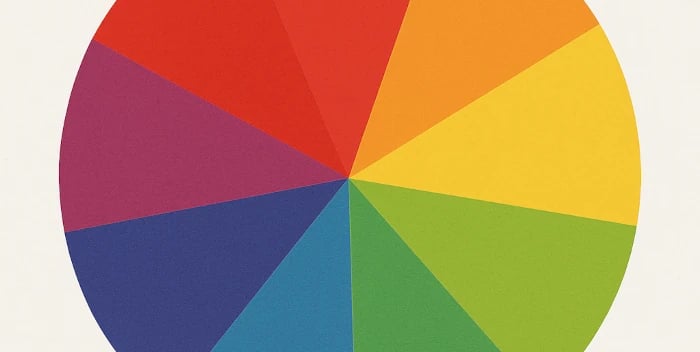
🎨 The Color Wheel: the Compass of Hues
Before we dive into the art of combining colors, we must meet their secret guide:
the color wheel.
A true visual compass, it gathers all the shades of the rainbow in a harmonious order —
like a dance between light and shadow.
There, we discover the primary colors (red, blue, yellow), from which secondary colors are born (orange, green, purple), followed by tertiary colors, delicate fruits of their blends.
This wheel isn’t only a technical tool:
it is a companion of inspiration.
It helps us understand why some colors attract each other — like blue and orange —
while others respond softly, in gentle and natural harmonies.
Artists, decorators, stylists and artisans have long used it to find the perfect balance between contrast and harmony.
Whether you’re choosing an outfit, creating a piece of jewelry, or composing a luminous mosaic, the color wheel becomes a magical key for revealing the most beautiful combinations.
💚 The Art of Combining Colors: Harmony, Emotion, and Personality
Colors speak before words.
They express a mood, reveal a piece of ourselves,
and sometimes add an unexpected spark to everyday life.
Learning how to combine them isn’t a fixed rule,
but a subtle dance between shades, reflections and sensations.
So… how do we find an harmony that feels like us?
🌞1. Colors and Skin Tone: Revealing Your Natural Glow
Before choosing jewelry or clothing, the colors around us converse with our skin.
Every complexion has its own light — soft, golden, rosy, or more neutral —
and some shades illuminate it even more.
Warm skin tones (golden, tan, or yellow undertones) are enhanced by earth tones, honey, coral, ochre, olive green, or warm turquoise.
Gold and coppery browns give them a sunlit aura.Cool skin tones (rosy, very fair, porcelain-like) glow with bluish, silvery, lavender, dusty pink, seafoam, or plum shades.
Silver and pale stones suit them beautifully.Neutral skin tones can explore everything, as long as balance is kept:
a warm touch, a cool nuance — harmony appears.
💡 Bohemian Tip: Hold a piece of fabric of a single color near your face — if your eyes brighten and your skin looks clear, that color is yours.
👗 2. Color Pairings in Clothing: Balance and Boldness
Matching colors in an outfit is a bit like painting your day.
There is no “mistake” — only adjustments to find the right equilibrium.
Tonal harmony: Choose one main color and play with its variations (navy blue, sky blue, royal blue). Soft and elegant.
Complementary contrasts: Dare opposites on the color wheel (blue & orange, red & green, purple & yellow). Dynamic and confident..
Chic neutrals: Beige, off-white, pearl grey or black highlight all other colors with finesse.
A pop of brightness: One vivid shade on a simple base creates a captivating effect without overwhelm.
💬 Free-spirited advice: Let your mood speak. A colorful scarf can change everything — sometimes a single detail lights up the whole.
💍 3. Colors in Jewelry: Reflections of Soul and Energy
Jewelry isn’t just an accessory: it vibrates with the person who wears it.
The color of a stone, a metal, or a dried flower set in resin can transform an outfit or soften the face.
Gold jewelry brings warmth, confidence and solar glow.
Silver jewelry evokes clarity, softness and serenity.
Colored stones tell a story:
Green soothes and regenerates
Pink comforts
Blue inspires
Red energizes
Yellow radiates
💫 Wearing a ring with buttercup reflections or a pendant of soft blue hydrangea is also wearing a fragment of natural energy that aligns with your own inner rhythm.
🌈 4. Choosing Colors by Mood: The Palette of Emotions
Every day has a color.
When the heart is light, we naturally choose soft, airy pastels.
When we seek strength, deep shades — burgundy, midnight blue, emerald wrap us in their presence.
And on days of quiet inner rain, a touch of yellow or pink can become a discreet sun on your wrist or in your hair.
💬 Remember: the colors you wear influence how you feel. They are like a visual caress on the soul.
🪞 5. In Home Décor: Creating Ambience, Soul, and Refuge
Color shapes our spaces as much as it shapes our moods.
It converses with daylight, natural materials, and the objects around us.
Mastering color combinations invites harmony into our home.
Neutrals (beige, linen, pearl grey, off-white) soothe and serve as a soft canvas for bright or deep shades.
Perfect for a natural bohemian atmosphere.Warm colors (terracotta, ochre, mustard, brick) evoke earth and sun.
They warm a room and pair beautifully with raw materials like wood or ceramic.Cool colors (blue, sage green, blue-grey) bring serenity and freshness — ideal for a reading corner or bedroom.
Color accents — a turquoise cushion, a vibrant mosaic, a lively flower pot — are like small sparks of life in a painting: they draw the eye, awaken the space, and give it a unique soul.
💡 Bohemian Tip: Mix textures before mixing hues. A light wall, a mosaic flower pot and a green plant can create a simple and living balance.
🕊️ 6. Daring to Create Your Own Harmonies
Rules can guide, but beauty often springs from instinct.
An unexpected combination, a mix of textures, a mosaic sparkle on a matte tone…
The most beautiful harmonies are often the ones that resemble us, even when they follow no rule.
This is what artisans do: they listen to color, to light, to matter, and create an harmony with a soul.
So whether you choose a dress, a piece of jewelry, or a handmade flower pot, choose it as a painter chooses their shades: with emotion — with you.
✨ In Conclusion
Combining colors is far more than aesthetics:
it is a way to express your energy, your softness or your boldness.
It is a dialogue between yourself and the world, between light and matter.
Combining colors is painting life with what we feel.
It is a silent language, an art of emotion more than reason.
And when color aligns with the heart, everything becomes harmony — on the skin, in the glow of jewelry, or on the walls of your home.
💫 Want to add a touch of color to your everyday life?
Discover the unique handmade creations in the Créa’Bohème boutique.
💛 To Continue the Dance of Colors
For your craft projects, artistic creations, home décor, or simply to align with your emotions and personality, colors are an infinite source of inspiration…
Here are a few tools to explore their secrets:
🎨 Set of 2 color wheels (15 cm), in French:
👉 Discover these color wheels in French
🎨 Set of 2 color wheels (14 cm), in English:
👉 Discover these color wheels in English
📖 A book to immerse yourself in the symbolism and beauty of colors:
👉 Discover the illustrated pocket guide “The Harmony of Colors”
✨ These links are affiliate links — small sparks of light that help support this blog and my artisan workshop.
As an Amazon Partner, I may earn a small commission if you make a purchase, with no extra cost to you.
Depending on your country, these links may redirect to your local Amazon page. ✨
French craftsmanship
Copyright©2025 Créa'Bohème